[Nomadecoder] CSS Layout MasterClass #1


SCSS MasterClass
Multiple example of what previous student have done in this class
some of the work is really good.

2020 version of CSS Class
1. INTRO
SCSS : standard of CSS for the other library and stuff? Sexy CSS?
Learning :
1. How to master layout css : how to make items separate? and layout positioning ( what I need)
TWO Techniquie : 1. flexbox 2. Grid
2. SCSS : how to make CSS more sexy
3. Two Gaems :
Grid garden / Flexbox Froggy.
4. Clone website (challenging website)
2. Dev environment
VS code
Chrome / Brave Brwower?
Node.JS ( why? we using SCSS is by using Node.JS)
Lecture *1
1. 0 Flexbox :
css :
inline : it is not a box cant use with width and height
inline-block: we can use widht and height
Before flexbox , when we making design by css only it's ugly and not interactive design so we need flexbox
.box {
  background: violet;
  width: 150px;
  height: 150px;

  display: inline-block;

  /* display : block(default)  has huge margin by the side no element next
    display : inline-block : keep being block and can be next each other
    display : inline :  not box just same line not a box and cat use with wid&height

    and this box has weird space between them as default
*/
}

.box:nth-child(3) {
  margine-left: 10px;
}
/* this let us change the each box location
but it is not responsive desing it will more likly
go bad in other scrren size*/
To solve this problem we use Flexbox ;
1.1 Flexbox :
1). you don't talk to children
2)make the flex container to the direct parent


/*rule for the flexbox

You dont talk to childeren
You have to have flexbox container
*/

.wrapper {
  display: flex;
  justify-content: space-around;
  align-items: flex-end;
  height: 100vh;

  /*this hiehgt for the continer size */
}

.box {
  height: 200px; /* this height and width for the box size */
  width: 200px;
  background: rgb(159, 199, 233);
  color: black;
}

/* 1.this dose not have the weird space between the box
    2. Can only talk to the direct fatehr */
default direction of flex : row =>. main axis is the horizontal
in the main axis you can move thing around using justify-contents ;
flex-direction :
cross-axis to move stuff we use : cross-items :


Important : when you using the aling-teims : check the height of the box and the container
1.3 Main Axis and Cross Axis
once you change the flex-dirction: column;
everything will be like horizontal way ( the cross axis) become the main (?)


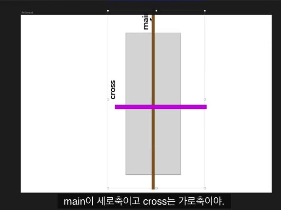
VERY IMPORTANT : in flex-dirction : row (default) vs flex-dirction: column ;
/*rule for the flexbox

You dont talk to childeren
You have to have flexbox container
*/

.wrapper {
  display: flex;
  flex-direction: column;
  /* justify-content: center; /* center */
  justify-content: space-between;
  align-items: flex-end;
  height: 100vh;
}

.box {

  height: 200px;
  background: rgb(159, 199, 233);
  color: black;
}

/*

main axis(horizontal row)  is deafulted setting of flex-direction:row(default) so you need to chagne ti
you can move around using (justify-content : space-around/space-between

corss axis (vertical row)
align-item to move thing in cross axis
 flex-direction:row(default)  * have to add height
align-items: center/strecth/flex-end/flex-start(default)
*/
'IT > Web Programming' 카테고리의 다른 글
| [NomadeCoder] HCSS Lay out 2주 완성반 challenge 2/14day (0) | 2021.01.13 |
|---|---|
| [Nomadecoder] CSS Layout MasterClass #1.1 (0) | 2021.01.12 |
| [Nomadecoder] Vanilla JS Challenge Day 2/14 (0) | 2021.01.12 |
| [NomadeCoder] HCSS Lay out 2주 완성반 challenge 1/14day (0) | 2021.01.12 |
| [Nomadecoder] Vanilla JS Challenge Day 1 /14 (0) | 2021.01.11 |